rfasstui: The rfasst User Interface
- Guide and Tutorial
tutorial.RmdIntroduction
The rfasst user interface was built to extend rfasst, an
open source air pollution model designed to explore the future human
health impacts, agricultural damages, and economic losses attributable
to air pollution. This vignette outlines the basics for interacting with
the rfasst user interface and includes a tutorial on how to use the
rfasst user interface to answer a simple science question: Which are
the projected premature deaths due to outdoor air pollution over time
for a specific region and globally? The tools and features in this
package will be able to show you the projected premature deaths
according to different Shared Socioeconomic Pathways (SSP) for a
specific region and globally.
To run this vignette, you will need to access the
rfasstui online application at https://bc3lc.shinyapps.io/rfasstui/ or install and
setup the package locally.
Setup
Simply access the application here: https://bc3lc.shinyapps.io/rfasstui/. To access the code or contribute, clone or fork rfasstui here: https://github.com/bc3LC/rfasstui.
Interface Guide
Once you have the web page loaded or set up the package locally, you will see the application home page, which contains some background information on rfasst, links to code and other resources, and information on how to cite this application. There are three main sections to the application: ‘Guides’, ‘Explore rfasst’, and ‘About’ located on the Navigation bar at the top. Within each section are subsections that access information and functionality.
The main interface of ‘Explore rfasst’ is also divided into two sections: a left-hand control panel that contains preconfigured scenarios and user adjustable model parameters, and the main output panel on the right for viewing model outputs. rfasst is run through “scenarios”, which are a set of emissions, physical and socio-economic parameters that drive the model. Built into the package are five Shared Socioeconomic Pathways (SSP) scenarios, which are climate change storylines defined by the lastest Intergovernmental Panel of Climate Change (IPCC) report. The default scenario, SSP-2, will be “checked” and you can click the ‘Load Graphs’ button to see different scenario outputs.
Scenarios
Scenarios are the main source of input for rfasst. They contain emissions, physical and socio-economic parameters calibrated to represent different SSP scenarios. The default selected SSP-2 scenario represents a “middle of the road” projection for emissions and global mitigation. To add additional scenarios for comparison, you can check any combination of the 5 SSP scenarios and they will be represented as their own series in the output graphs. Try checking the SSP-4 scenario. You should see a new series appear in the Premature deaths graph where the number rises faster than the SSP-2 scenario. The SSP-4 scenario represents somewhat of a “road divided” scenario with low mitigation and high adaptation. To view projections of other outputs choose some more variables (up to 4) in the graphs section and you should see additional graphs representing rfasst’s impact projections of those outputs.
Custom Scenarios
The rfasst user interface allows advanced users to customize their own scenarios via the “Custom Scenarios” tab in the left hand nav. The custom scenarios use the Global Change Analysis Model (GCAM) outputs gathered in an rgcam project. To create a custom scenario you will need to run GCAM and rgcam as detailed in this step-by-step tutorial. Once done, you will see your scenario’s output in the graphs on the right, just like one of the preconfigured scenarios.
Other Outputs
In addition to the main graph interface, rfasstui also has a few other outputs. On the graph tab, there are a “Download graph” and “Download data” buttons under each figure which will download the complete time series output for all of the corresponding scenarios and chosen figure output variable. Clicking the “Download map” button in the “World Maps” tab allows you to download the generated maps.
Tutorial Scenario: Determining the projected premature deaths over time for a specific region and globally
| Tutorial Step 1: Getting Started | Example |
|---|---|
| To begin the tutorial, make sure you are in the “Explore rfasst” tab and click the any of the “Standard Scenarios” available, or leave it as rfasst default. The different scenarios contain unique input parameters that drive the rfasst model’s output. For the purposes of this experiment you may choose whichever you like. Click the ‘Load Graphs’ button! | 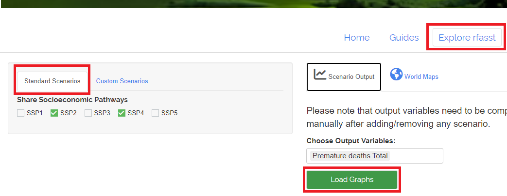 |
| Tutorial Step 2: Downloading data and figures | Example |
|---|---|
| Click the ‘Dowload graph’ button and ‘Download data’ button to download the figure and raw data for further inspection. This data represents the global World value by year and scenario. | 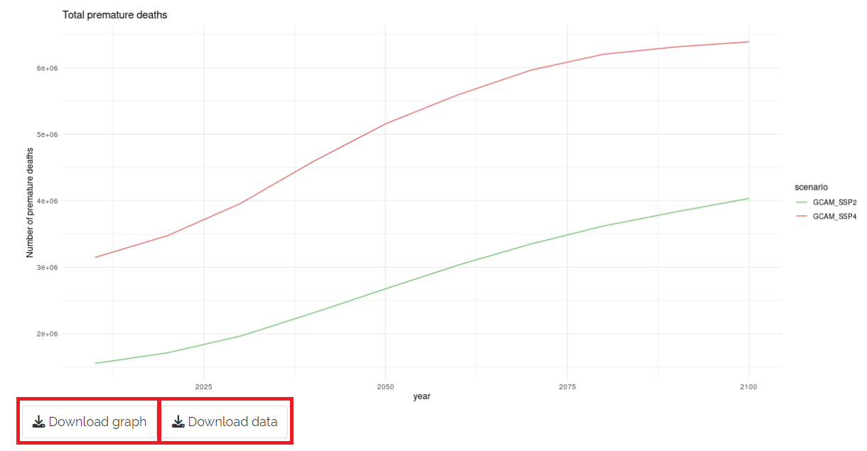 |
| Tutorial Step 3: Displaying maps | Example |
|---|---|
| Go to the “World Maps” tab and select ‘Premature deaths Total’ on the ‘Choose Variable’ dropdown. Select any available year in the slider and click the ‘Load map’ button! | 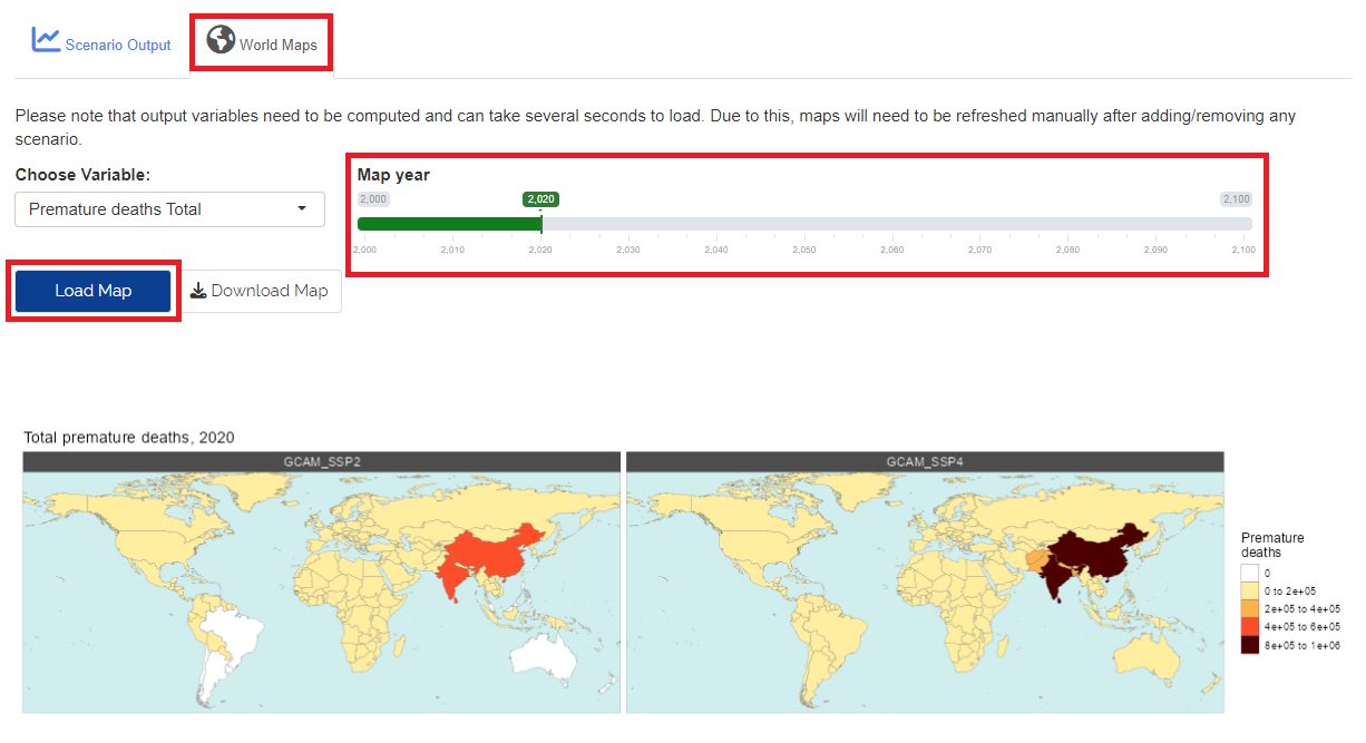 |
Conclusion
This concludes the tutorial and interface guide. After completing this, you should have a basic understanding of how the interface works, how the different pieces interact, and how to create meaningful output. For more detailed information on rfasst, check the “About” section for links to the formal model description paper, the source code for rfasst, and other related links and information. Feel free to examine and explore as much as you want.